“King Kong – part 1. ” by Dan LuVisi Introduction: Hello! Today, over the course of three separate parts, I will teach you from step one to the finish on how to paint my painting of Beauty and the Beast. This is a much sought out tutorial, and will require experience in Photoshop. As I move through it, I will teach you some of my tricks, shortcuts, and helpful hints to achieve photo quality work. It will definitely not be easy, but I’ll try my best to help each and every one of you through this. Remember, this picture took me a week to do, 10 hrs each day, so don’t think you can fly through this one. Shall we begin? The Sketch: Now with each new painting, I always start them off with a quick sketch. Mostly a scribble, it’s been said in all of my tutorials, it’s just how I do it. I work on a canvas size of 500×900 and sketch away, for this King Kong image, I wanted to base it off a wallpaper I saw off the official King Kong movie website. I wanted to achieve photo-real with this painting, and I would put every ounce of detail I could into the piece to achieve that. So after my quick sketch, I grab that photo of Kong, match up the proportions with a grid, and start to detail away. You can also lie over a blank layer over the original Kong photo and trace it if it’s too hard to draw. There’s no shame in that, just don’t smudge a photo now! To start it off, resize your original scribble to a higher resolution, mostly in the thousands. Then create a blank white layer over the scribble, turn it’s opacity down to 80%, then create another layer over the Blank Layer, which will be your line art layer. On the line art layer, you will be using this to achieve. 3Dtutorials.sk recommendation: To maximise the realism of your 3D creatures we recommend to use high quality animal photo references from the #1 texture website www.3D.sk 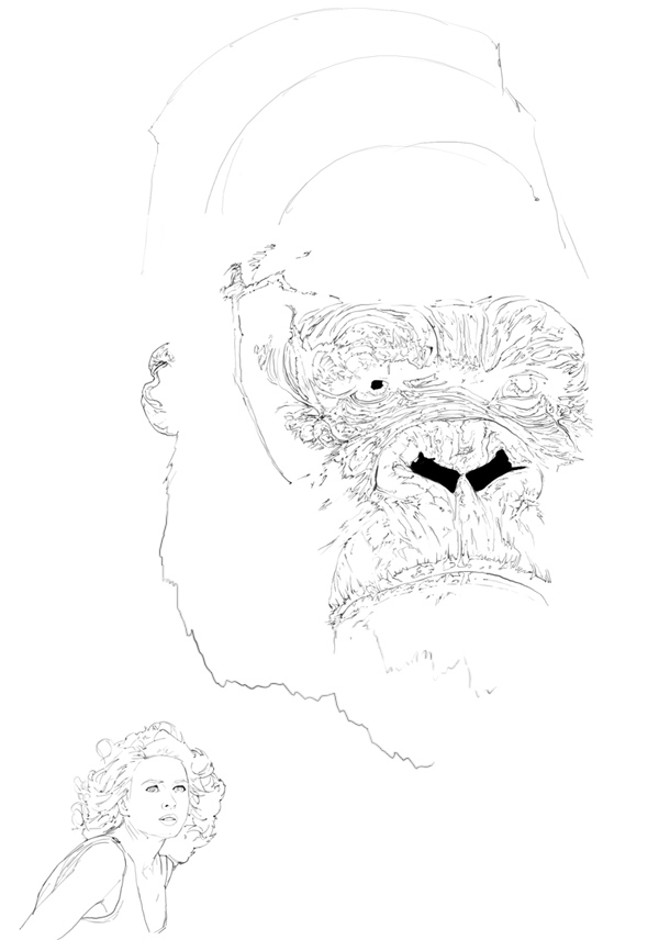 Once you have your sketched out piece, which is above, make sure you have every tine detail in there. It is definitely going to help out later during the painting to have all those creases, wrinkles, and scars. Make sure you eye that photo down and get every bit of character out of it; you want to basically have a line art of the original movie poster. You shouldn’t worry about the hair just make a little line for where it’s going to start/end. As for the female character, Ann Darrow, do the same as you did with Kong. Make sure you get those proportions down, you want to get her to look as close as you can. Why? The smallest error or flaw in her face will make her look completely different. Once you have Ms. Darrow down and drawn (remember, on your line art layer), create a new layer underneath the Line Art, but over the Blank Layer. This is where the fun begins. Coloring, Laying Down the Blobs: This is where the fun begins, but the hardness starts. It’s easier than it could have been if we were working off our imagination. Simply, use the Eye Drop Tool (Shortcut in Photoshop CS 2, “I) on the poster, and select the most dominant colors on King Kong. What you’re aiming for is to nab the basic blue that’s on his skin. You can see it overwhelming all the other colors in the second picture.
 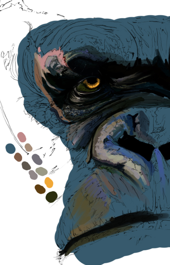 Here you’re going to lay down a flat blue underneath the line art. When that is through, start to lay down some of the other colors, such as the greens, grays, darker blues, browns and other choices as shown in the Splotches. On the line art, where the wrinkles are, try to add some tiny bit of depth to them. It’s nothing yet, but it will change evidently. Form shadows underneath the nose, around it and also under his brow and eyelids. The scar tissue will obviously be the source of the pink colors, so fill those in. Remember, we’re just laying down blobs, nothing more. Don’t go too overboard and try to paint it all right here, start small as I did.
King Kong – part 1
Popular Tutorials
-
 Free set of photo references for our members
Posted on Nov 15, 2010
Free set of photo references for our members
Posted on Nov 15, 2010
-
 Photo References
Posted on Oct 6, 2010
Photo References
Posted on Oct 6, 2010
-
 Modeling Competition
Posted on Dec 10, 2010
Modeling Competition
Posted on Dec 10, 2010
-
 Modeling a High Definition Building – part 1
Posted on Dec 9, 2010
Modeling a High Definition Building – part 1
Posted on Dec 9, 2010
-
 FREE photo reference sets for you – only for registered members
Posted on Oct 2, 2011
FREE photo reference sets for you – only for registered members
Posted on Oct 2, 2011
Try something new

Latest Comments