“Frog King” by Chris Beatrice
Beginnings
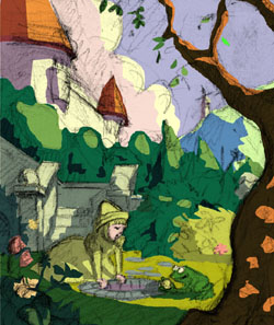
The fairy tale world is one of extremes. Sure you’ve got cute princesses and benevolent fairy god mothers, but you’ve also got parents purposely abandoning their kids in the dark forest, where they are imprisoned by a serial killer who intends to cook and eat them! Maybe this is why these ancient stories touch such a raw nerve in most of us. To me the fairy tale world is one of magic and hyper-reality, and that’s how I sought to represent it in my painting, The Frog King. I wanted this world to feel alive, with just as much life and character in the leaves, trees, rocks, buildings and hills as in the real living characters themselves. I want the viewer to look at the image and wonder what’s over that next hill… I had just completed a somewhat darker picture, done in black and white, from a fairy tale called “Jorinda and Joringel” (executed mostly in Painter 8), and decided it was time to do something lighter. I wanted to use a very broad color palette, creating several mini paintings within the painting, each with its own “characters” and color schemes, all connected into a larger image.

Style and Approach
With 3d rendering and digital photo manipulation, simply depicting reality convincingly in a 2d image has become trivial. I want my pictures to look like paintings, and to do that I approach the final painting in the same way I approach an acrylic or oil painting. I decide how I’m going to paint each area, mix a small palette of colors for the given area, then apply brushstrokes with as much freshness and economy as possible. Fortunately, with the digital medium I don’t have to worry about making mistakes, and can continue to adjust colors and values throughout the entire process, however. Stylistically, for a piece like this I’m walking a line between the “watercolorist” in me vs. the oil or acrylic painter. The former wants to create work that is atmospheric, loose, textured and transparent, while the latter wants something solid, tangible, where it feels like you can pick up objects in the scene, and walk in the scene – but without it being photographic.
3Dtutorials.sk recommendation:
To maximise the realism of your CG illustration we recommend to use high quality photo references from the #1 reference website www.environment-textures.com and www.female-anatomy-for-artist.com

Thumbnails
Usually when I read a story I am instantly hit with a vision of how I want to depict it. I then need to get that image on paper quickly and clearly. I do lots and lots of thumbnails… tiny, tiny thumbnails. Working this small (like 2”x2” or smaller) allows me to focus entirely on the composition and large elements, without getting bogged down in details
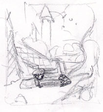
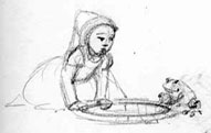
Sketches
Next I do a few slightly larger sketches to provide a little more detail and resolve any remaining questions. I’m still not working very large (about 4″ x 5″), and not looking for a lot of detail at this point, I’m just trying to establish the basic elements quickly. This is as far as I go with sketch work before starting to paint. I do not do tight pencil drawings, because I want the brushstrokes and shapes in the final painting to be as fresh and dynamic as possible. I don’t want to be simply filling in, coloring or tracing over existing line work, as this often results in the final image looking more like a colored drawing than a painting. I scanned the sketch, brought it up to the right size (2100×2700 pixels or 7″x9″ at 300dpi), and made it a multiply layer in Photoshop so all the white areas are transparent.


Planning the Palette
Under the sketch layer I created a layer for planning the colors, which will ultimately become the final painting layer as well. Using the lasso select tool and the fill tool in Photoshop I lay out a few shapes, and fill them with color. This forces me to think only of big, simple shapes, and flat, solid colors (so there’s nothing for me to hide behind!). To avoid unsightly haloing between the different areas of color as I adjust them I don’t use any anti aliasing. I’m not going for photorealism in a picture like this. I don’t want lots of deep black shadows and desaturated colors. I want bright colors, and in order to do that I need to get them under control not by simply subduing them but rather by setting up the extremes, and then, most importantly, the connecting colors.
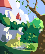
Color rough, initial pass
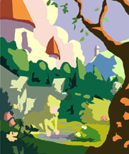
Color rough, final
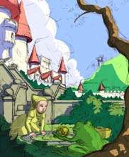
In this image getting the color of the stairs right was crucial, as they connect the cool, purple blue background to the warm, yellow-green-red foreground. Note how poorly this is working in the initial color rough, where the steps appear quite disconnected from the foreground. The final color rough, with the pencil sketch overlaid, conveys most of the feel of the final picture, yet it takes only an hour or so to get from thumbnail to this stage. I now have a very comprehensive image to guide me throughout the final painting, though the drawing itself still lacks detail.
Reworking the Composition… or not
At this point for some reason I decided I could do better with the composition. I thought it would be a good idea to make the frog larger, so he would have more character and take up more of the scene. However, I was initially reluctant to make him grotesquely large, so I tried moving the viewpoint down very low, and bringing the frog to the front side of the well so he would appear much larger on the 2d surface of the picture. I also wanted to add more architectural elements to the castle, to enrich the image… But then I didn’t like the fact that the frog’s face was not exposed, and I also felt the background was getting cluttered. I decided I preferred the simplicity of the first composition, so I went back to it.


Latest Comments