“King Kong – part 3. ” by Dan LuVisi
Refining, Step 6, Custom Grain
Now most of my pictures for a while have always had a custom grain layer created over them. I will tell you how to create the grain, but in steps.
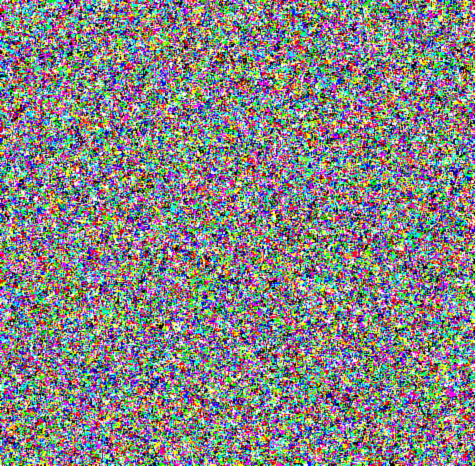
Step 1: Create a new layer over the entire picture (once it is fully finished) and set it to Overlay.
Step 2: Fill the layer with Grey (RGB:128) the layer should look transparent.
Step3: Go to Filters<Add Noise. In the box where it says AMOUNT put 400%.

Step 4: You will then apply a filter, 3-4 times, up to you called “Brush Strokes – Spatter” which will make it look quite weird.
Step 5: Then go to Filters<Blur<Blur which will soften the overall shapes.
Step 6: Finally you will adjust the opacity of the layer; I usually make it 5%-8%.
That’s all!
Background:
Even though this tutorial doesn’t list background in there, I’ll give you a quick tutorial on how I did it. First I did the line art, with straight lines so the perspective was dead on. After that, I made a new layer over it, going over the line art with tiny details, such as dirt and what not as if you were sketching a picture of a building. I then made a layer underneath it and set the line art layer to Multiply. As always I started painting the environment with basic colors, putting down a solid block color with 100% opacity for the over all background. Why I do this? Because you wont get transparency issued with the colors, after I have my solid colors I set the brush to Pen Pressure and start to paint my highlights and shadows. Just go messy here, it doesn’t matter it will all be blended in the end.
Once those colors are laid down on the background, I go piece by piece of the design of the Empire State Building (which is what’s behind him) and start to blend them together. For example, the left (ours) part of the building which is shades of green, to get that dripping dark green feel I painted a bunch on a separate layer of green strokes then set motion blur downwards on it. After I merged them together, I then smudge the greens (from the motion blur) into the rest of the old yellow type of metal. As we move on to the right, you get the beige type of color which is a tad brighter. This one had no filters, but rather strokes over strokes with a soft brush. Then I cropped part of it with the Magic Lasso, Layer Via Copied it and set it to screen and dropped the opacity a bit. For the right side of the picture, I cheated a bit I will admit. I made one slab of metal, then copied it and pasted it below, and then below. After I merged them with the background, I would go and finely detail them up. Adding etches, scratches and darkened spots. That’s it for the background, nothing more to add onto that.
Conclusion: This is the end of my tutorial, I hope you have learned much from it, whether it was a small tip or a large one! Don’t think this is an easy picture, it took me a week straight (of 12 hour drawing periods) to finish it. This is no cake walk, so don’t get angry if it’s difficult for you. I tried to speak my best Photoshop English for everyone out there, so hopefully you guys don’t get too confused. But I hope everyone gets this tutorial and has a great time with it. Enjoy and keep painting!!
(c) Dan Luvisi, dmxdmlz@aol.com


Great effort within this Jesse. Another thing in relation to Yext that is certainly well worth bringing up: if some of the actual mate internet sites has their own own report which is considered possession involving in that case that data takes priority.
[url=http://runforhumanrights.org/ugg-boots/uggs-moccasins-on-sale.html]uggs moccasins on sale[/url]