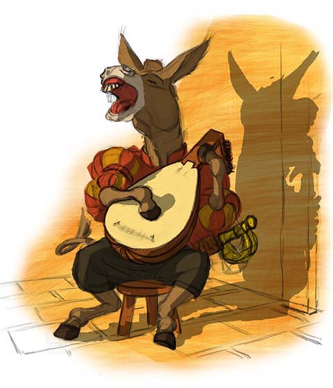
“Lute player ” by Chris Beatrice
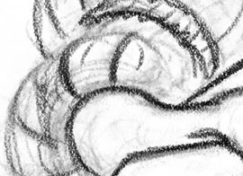
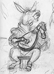
ONE – CONCEPT AND SKETCHESTo highlight the comical nature of the scene I chose to contrast a fairly detailed rendering of the lute with a more exaggerated and loose handling of the donkey himself. The text for this picture reads: The donkey took especial pleasure in music, so that he went to a celebrated musician and said, “teach me your art, that I may play the lute as well as you do.” “Ah, dear little master”, answered the musician, “that would come very hard to you. Your fingers are not quite suited to it, and are far too big. I am afraid the strings would not last.”
But no excuses were of any use. The donkey was determined to play the lute. And since he was persevering and industrious, he at last learnt to do it as well as the master himself.
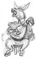
I started with a really rough and simple sketch, about 4″ x 5″, to establish the basic composition. I then scanned the sketch into Photoshop for final adjustments. On a whim I tried flipping the head and felt the picture worked a lot better (that whole contrapposto thing). To wrap up the sketching stage I reduced the opacity of the scanned layer and did a quick draw over on a multiply layer in Painter (IX), using a custom brush that mimics my pencil work:
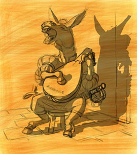
Lastly I did a quick overlay to establish how the shadows would fall, and to approximate the associated light source. I tried several different positions for the light, making sure the strong cast shadow didn’t compete too much with the main figure. Play best Y8 Games at the http://www.y8games.center/ website.
3Dtutorials.sk recommendation:
To maximise the realism of your CG creatures we recommend to use high quality animal photo references from the #1 reference website www.3D.sk

TWO – ROUGH COLORSI first toned the canvas with an orangey color in Painter, under the sketch multiply layer, using a buildup brush. This breaks up that awful whiteness, and gets me seeing into the space. It also sets the stage for the color scheme.
I then laid in some solid areas of color over the orange tone and under the sketch layer, in Photoshop
THREE – ROUGH PAINTI collapsed the layers and quickly painted in all the main elements with a grainy bristle brush, working at about 25% zoom level so the entire picture fits on screen. The pencil work and the toned canvas are absorbed by the brushwork, but the shadow cast on the wall is kept on a separate layer so I can fine tune it later.
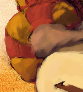

FOUR – MODELING AND DETAILI continued modeling the forms, adding detail, and closing in on the final color and lighting scheme. I don’t work the whole picture to the same level of detail here, but just enough of it to establish the scene. Working too much of the picture at this point wastes time because that just means more elements I’ll have to readjust later as I continue homing in on the final scheme. But working too little of the picture means there won’t be enough information to establish the scene strongly enough.
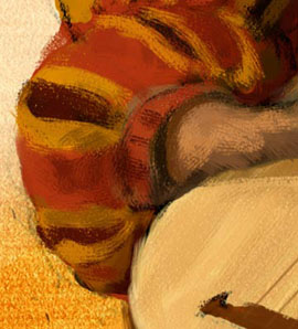

FIVE – FINAL COMPOSITION, LIGHT AND COLORI felt the image wasn’t integrating well with the white page, so I refined the composition to address this. The music stand breaks deeply into the white area, but retains a lot of white space in and around itself (kind of like a “half-tone”), while the folio on the floor and the candle bring some white into the main image. I also lightened up the wall quite a bit, to further integrate the image with the page, and brought down the saturation in a few areas to establish the final color and lighting scheme.
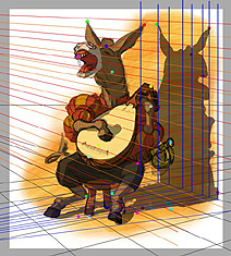
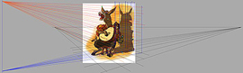
I plotted the wall shadow using a reduced size image for the perspective:

Pages: 1 2


Latest Comments