
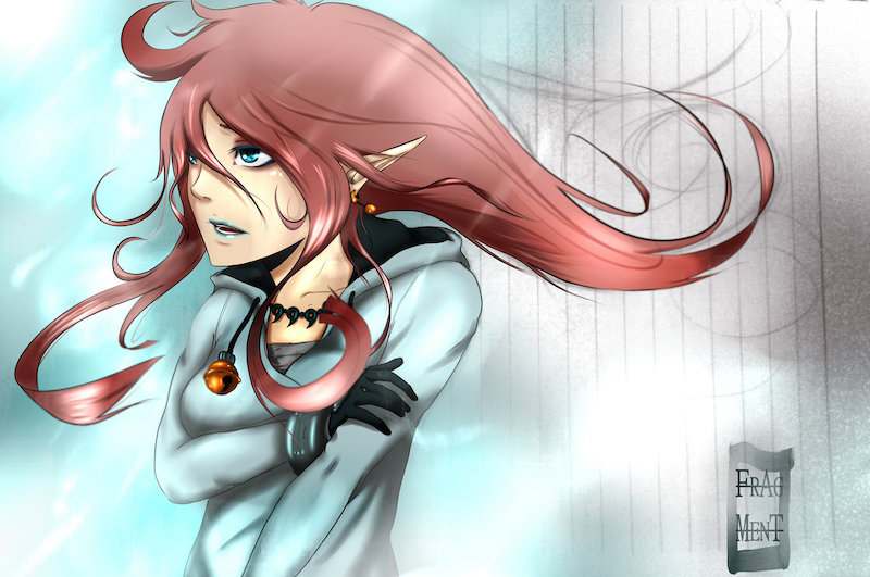
Welcome to second part of my tutorial (first part is here). Some people on DeviantArt asked me if I could do a tutorial on how I do my colorings. Well I really felt glad and really wanted to give it a try…so I hope that you are interessted on how I do my drawings as well 🙂 Final version of my drawing is at the end of this tutorial. I used Painttool Sai, Photoshop CS3 and Wacom Intuose 3 tablet. We will add background this time and do the final edits in Photoshop.
Step 11
Now background! In this picture I decided to leave the sketchbook background and let it be part of it. So I put the basic background color above it and ‘blur’ it at the edges, to make it look soft and smooth…

Step 12
To make it look a bit more realistic and more ‘lifely’ I clip a new layer to the LINEART-layer and add flat colors to it…you can even make it look lineless, but I like it that way more 🙂
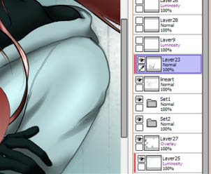
Step 13
Now I add the highlights (mode-Luminance) to the eyes by creating layer above the LINEART, that way I am colouring above it.

Step 14
OK now let your creative mind free and add a few things, by using the steps from before. for example I made it look like it’s cold and snowing (used the airbrush in dry brush mode ->experiment with it 😉 ). Well in mostly all of my drawings I add an OVERLAY-layer above the whole drawing which gives it more contrast and variety in colors.

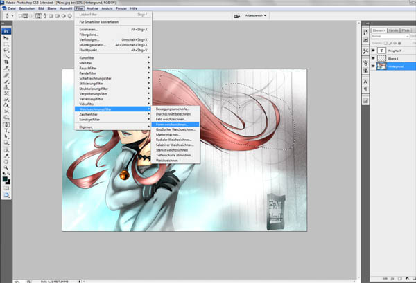
Step 15
Let’s open Photoshop now. I use it to make picture look more dynamic. It’s a really easy way to make things look like they are in motion. Use the lasso or the pen-tool to select area you want to look dynamic.

Step 16
Then soften the edges.

Step 17
Just like that 😉

Step 18
Then I go to filters and use blur. I often use about 3-8 pixels, but you’ll need to look for yourself what fits you best. You are almost at the end, just fix the colors and add your signature.
Voilà!
Keep on practicing and I am sure, you’ll surpass me anytime soon 😉
You can check the final image in high-resolution here (1600x1062px 291kb).
If you are looking for an inspiration for your drawing, I recommend www.photo-reference-for-comic-artists.com. You can find plenty of comic – looking resources in there!


Latest Comments