
Some people on DeviantArt asked me if I could do a tutorial on how I do my colorings. Well I really felt glad and really wanted to give it a try…so I hope that you are interessted on how I do my drawings as well 🙂 Final version of my drawing will be published in second part of my tutorial. I used Painttool Sai, Photoshop CS3 and Wacom Intuose 3 tablet.
Step 1
First I always (well mostly) start my picture with a rough sketch, that I did in my sketchbook, means with pencil and paper. Then I photograph or scan my pictures and edit it a bit in PS CS3.

Step 2
Next I open the picture in Painttool SAI and change resolution (often about 5000 pixels) and put the layer ‘luminance to transparency’. That makes a few things easier later. Before I start the LINEART, I make a NEW LAYER. Important cause otherwise my lines aren’t separated from the sketch layer!

Step 3
Best feeling / settings with my pen.

Step 4
For the Lineart I always use the airbrush tool, cause it is easy to handle and matches nice thin lines. While drawing I often change the density or min size, but my default settings are mostly like this. When you start drawing with the tablet, make sure to make clean lines by putting line after line together. That’s how i started.

Step 5
OK we’ve finished LINEART. You can see that I changed a few things and didn‘t go right accordingly to the sketch. It is important to always have an eye on proportions (I still got problems with that 🙂 ).

Step 6
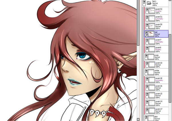
Now things get interesting 😀 I made a new folder and a new layer, named SKIN (kinda logic 🙂 ). I roughly add the basic skin color by FILLING with the fill tool, and always making sure that l don’t miss spot. It isn’t important to add the skin color just at places where it is supposed to be, cause you’ll add lots of layers above It afterwards. Next l clip a new layer to the SKIN layer (Picture 2 -> clipping group button in the layer window) and add the second skin tone -> well for that one I use a very low density and a big min size (min size about 70% and density about 50%). To soften the lines and make them look more realistic, I use the most awesome tool of Painttool SAI -> THE BLUR-TOOL! Try it out! You will love it! By clipping the layers I can spare much time and things get rly easy, thats why I always have a big mass of layers. In Picture 4 I, again, clip a new layer to the SKIN layer, change the mode to luminance and add a few highlights by using the basic skin color.

Step 7
Just look at the eyes and the mouth. Separate the layers into EYES and WHITE and clip shading layers according to the areas.

Step 8
I did the same with HAIR: Layers: HAIR -> Darker Tone -> Highlights (luminance) -> OVERLAY (with dark color to add higher contrast).
Step 9
To make the hair look more ‘lifely‘ I often draw a few lines out of the LINEART. And when I start to shade I roughly add the darker tone and thin it out with the rubber tool.

Step 10
Now that I am ready with the face, I make a new folder and make a new layer for every new basic flat color. I’m using the same way, like with the face, i clip all the shading layers to the flat layers.
To be continued…


Latest Comments