“Advice from a Caterpillar ” by Chris Beatrice
1. Sketch
For this picture I drew a slightly more detailed sketch than I customarily create, although I still felt the need to alter the composition after “painting.” The sketch was begun with (real) pencil and paper, then finished in Painter using a custom brush that pretty closely mimics my pencil work. 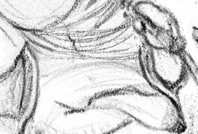
3Dtutorials.sk recommendation:
To maximise the realism of your CG illustration we recommend to use high quality photo references from the #1 reference website www.3D.sk www.environment-textures.com and www.female-anatomy-for-artist.com

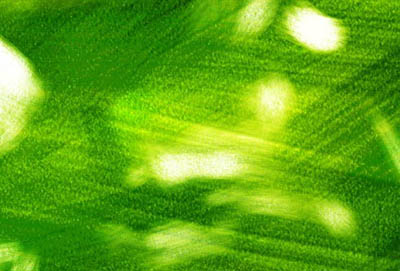
2. Tone and Rough Values
To begin the underpainting I tone the “canvas” with a large brush that using the Buildup method, on a Gel layer. This gives a unique value / saturation curve, essentially making the middle values the most saturated, and moving out to white and black (no saturation) on either end of the value scale. This is very much like how watercolors or translucent oil paints operate. I use a layer mask to erase pigment, because painting over with white would spoil the aforementioned saturation curve. The goal here is to establish some kind of key color for the image, and begin to set up the basic value relationships. I don’t overtly think in terms of just three values, though in practice that seems to be what happens.

3. Final Values
This is as far as I take the value study – just enough to indicate all the basic relationships, and more importantly to break up the canvas into texture and shapes so I feel like I’m looking into a space vs. staring at a flat surface. It’s always remarkable to me how much you can read from the image even at this crude stage. Notice how I’m flip flopping the value relationship between the underside of the mushroom and the foliage behind it. In step 2 the underside of mushroom is darker than the foliage… in step 3 this is reversed, and later in step 5 it goes back again! As with all picture making issues, this is not about imitating nature, nor trying to gauge what the scene might look like in real life, but about consciously setting up the relationships that are going to make your picture read the way you want. 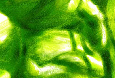

3a. Completed Underpainting
This stage shows the value study from step 3 with the sketch overlaid and colorized slightly. To do this I make a new layer that is completely filled with my colorization color (in this case a dark green), add a layer mask to this layer, then invert the sketch (so the lines are white and the “paper” is black), then copy it into the layer mask. I then tweak the main color using Hue/Saturation, and I also play with the opacity of the layer and the levels of the mask (to apparently sharpen or dull the line work). 

4. Laying in Local Colors
Now I begin to place some local colors into the framework created by my underpainting. I’m still working zoomed out at 25% or 30% (as big as I can and still fit the entire image on my monitor). Because the underpainting is so green, you’ll see that my local colors are all “greenish.” Even the reds are… greenish. This is not the result of transparency or any other inherent factor, but because I am consciously trying to fit my local colors into a green environment. As I gradually begin to represent more of the full spectrum in the picture, I will widen out the color range bit by bit and approach the final color scheme. 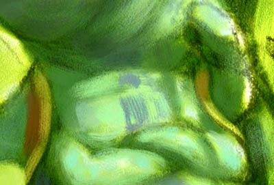


Latest Comments