JEALOUSY STEP-BY-STEP by Steven Stahlberg
Overview
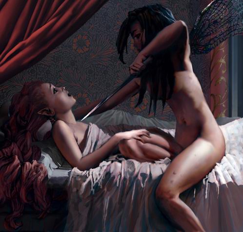
The idea to this painting came when I sat down with my notebook in my sofa one evening, and tried to come up with something that was both upclose and personal, yet touched on larger issues, such as affairs of state. Preferrably involving only two people, because I find that can often be more intense.A royal assassination, I thought, and since I like Fantasy, it became an idea of two fairy sisters, one of them Queen, and a serious case of sibling jealousy. I added a sleeping husband in the background, to supply one more possible reason for jealousy. Later, I came up with a whole screenplay based on this and two of my other paintings featuring fairies.
1. The sketch

Roughly sketched on small notebook paper without erasing. No references at this stage, except for the curtain. I was happy with the first version, so I scanned it into Photoshop, cleaned it up, enlarged it. If you can, use a Wacom, I think you really need one for things like this.
1b. Cylinders and light

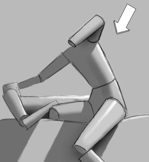
All good art courses teach the basics by making students draw spheres, blocks and cones in different lighting, over and over. This seems tedious and often useless to the beginner, but is the only way to learn about highlights and shadow. First you must be able to draw simple geometrical shapes (cylinders are good for the human body), with proper perspective and proportion etc. Then you must imagine the light and shadow. It helps to imagine the path of the light, then the bounce, and then its path to the eye – see it as balls on a pool table, bouncing off the sides.
As you can see my sketch already included the basic direction of light – sometimes I’m unsure of which kind of light I want, but in this case it came to me at the same time as the initial idea. I wanted the killer’s face dark, the victim’s face and hand, and the killer’s leg and back bright. I also wanted the light fairly directional and stark, but since it’s night I also tried to keep as much shadows in there as possible.
2. Gray-wash on sketch


Now I develop and clarify the lighting I had in mind, working black&white first because it’s easier to only worry about one issue at a time. I use a hard-edged brush with pressure-sensitive opacity.
First, a mid-range grey wash over the whole image (New Layer, Multiply). Then fill in darker shadows. You should end up with 3 or 4 basic groupings of tone, from black to white. For the beginner, the simpler the better, so try to stick to 3: black or very dark, mid-grey, white or very light. You may not be able to stick to that formula, but it’s good practise simply thinking about it.
3. White highlights

Next I fill in whatever should be lightest. Note the similarities to the cylinder/cone sketch above.
4. Refine

Now I started using progressively smaller brushes, also Smudge and Blur and Airbrush. Smudging the sharp edges left from the hard-edged brush is my most common and favorite way to work. Blur is a bit all over the place, and uncontrollable, while Smudge can act more like Motion Blur if you’re careful, and if you use a spotty brush it can look a bit streaky like oil color.
5. Color layer

To start adding color, make a new layer, mode: Color. Fill in local color on that layer, in big chunks like this. Fleshtone = 1 chunk, red hair = another, etc. You can also Select a whole area and use Image>Adjust>Hue/Saturation>Colorize on it.
You can also use brushes set to Color or Hue.
Colorized grayscale images tend to look metallic, because on metals the highlight is more saturated and the darker parts are less so (look at copper and gold). This is exactly what you get when you colorize – most noticeable when you apply a flat color on top using ‘Color’ or ‘Hue’ mode, but also with ‘Multiply’ and ‘Normal’ with transparency.
On most other matter though (especially on semi-translucent materials like skin, hair and bedsheets) the relationship is reversed – shadows more saturated, highlights less. So we can’t just apply the single color indiscriminately the same over both shadow and highlight, we need to vary it. (See my skin shader tutorial.)
6. Refine

Here I’m refining the colorization further – note the different hues on the sheet and skin, the blue shadows, the reddish shadow-edges etc… it’s exaggerated at this stage so that (hopefully) some of it will survive into the final image.
When you’ve taken this as far as it can go, start using brushes in ‘Normal’ mode. (Again I use round hardedged brushes, with pressure sensitive opacity mostly, occasionally Airbrush or texture brushes.) You’ll know when it’s reached that stage, you can feel it – the point of sharply diminishing return. It gets harder and harder to see what you’re doing with these modes, since they’re very transparent and subtle.
For the next level of subtlety it’s best to use straight Normal mode. But if the preceding stage of colorization has gotten you close enough, you won’t need to cover all of the image with 100% opacity, you can focus on some areas, which makes it easier.
Now is also the time when I enlarge the image to it’s final resolution, to get all the detailing done with the opaque paint.
7. Use reference
At this stage I reconsidered, and belatedly went for reference. Since it was hard to find anything fitting, I shot my own. Note: Never copy 1 single reference to closely, if it isn’t your own; it’s surprising how many beginners don’t realise it’s against the law to make an image that looks too much like someone else’s. However these sites – 3d.sk and Female Anatomy – specialises on this type of references and sell royalty free photos that you can use for your projects.
8. Finished image

Copyright 2004 Steven Stahlberg www.androidblues.com


Very Very Nice keep on going!
i think this is officially the coolest thing i have ever seen. i want the program that helped you do this.