
A tutorial on how to colour a peacock. I’m aware that my working technique is a bit specific. I hope you’ll enjoy it anyway (I also enjoy other artists’ tutorials and walkthroughs.
Watercolour Walkthrough
Jewelled Beauty
MATERIALS
Regular printing paper for a sketch, Arches hot pressed watercolour paper, Schmincke
watercolours in tubes, calligraphic brushes for background, small synthetic brush number
00 and blended brush (Dreamcatcher) number 2 for the peacock. And last but not least,
water 😉
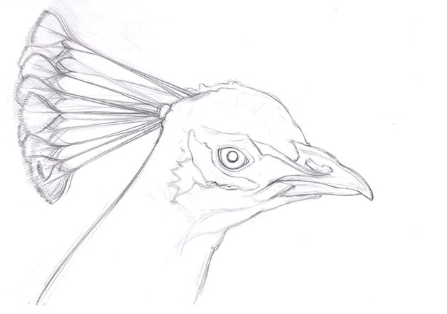
Step 1
I chose a reference picture and started with a sketch. It’s fairly detailed, as you can see.
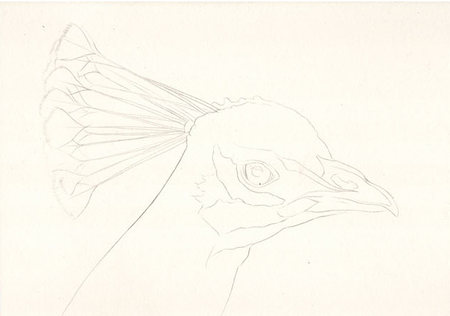
Step 2
At this stage the sketch is transferred onto watercolour paper. I do that by scribbling with some soft pencil on the other side of paper with the original sketch. Then I put it on watercolour paper and simply re-trace the drawing. You may see how much are the lines cleaner compared to the original sketch.
Step 3
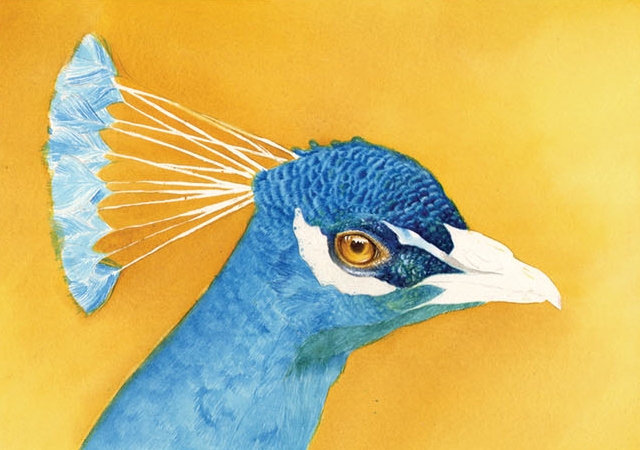
I went for a very simple background (which isn’t entirely typical for me) because I didn’t want to draw attention away from the detailed peacock’s head. I chose warm, yellowishtones for the background, because of the contrast it will create with the dark blue peacock. So, here you can see the first two layers – I started with an aureolin modern and then added some indian yellow. To achieve an even tone I had to dampen the whole watercolour paper with clean water beforehand. I also masked some areas on the peacock with masking fluid – edges of his beak, the shine on his eye and the quills on his head.

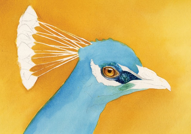
Step 4
The background is pretty much completed here. I used, in this order: Aureolin modern, indian yellow, titan gold ochre, indian yellow, light ochre, raw sienna, indian yellow. Then I started working on the eye. I went with the same colours I used on the background (even though peacocks have actually dark brown eyes). I just wanted the background colours to be reflected on the peacock somewhere.
Plus, I like golden eyes better 🙂 I removed the masking fluid from the eye and the quills.

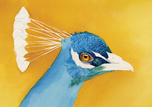
Step 5
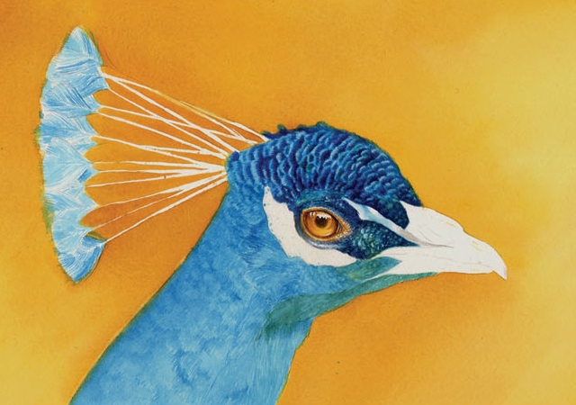
Couple of things happened so far – first of all, I finished the eye. I used some brown tones (as raw sienna and umbra) to do so, and I enhanced the shadows with a dioxazine violet. As a next step, I painted the whole peacock with two layers of a cerulean blue. It’s not very pretty, uneven and blurry, but it really doesn’t mind, because it won’t show on the final painting. I painted the skin around his eyes with a little dots of payne’s grey bluish and raw umbra. I also started with the main work – feathers. Basically, I work on feathers with little strokes, and they are always darker and denser on the “bottom” of each feather (in order to achieve the illusion of plasticity). I have to admit, I painted almost entire peacock with a super small brush number 00. It requires some patience, considering that I usually paint with many layers, but I really don’t mind 🙂
Step 6
I continue working on the feathers. After a while I settled on which colour I use for them – it was mainly cerulean blue (two or three layers), pads blue, delft blue for the darker tones and touch blue indigo (which didn’t work for me so I removed most of it afterwards). I also added touch of some greens here and there, prussian green and cobalt green mostly.
Step 7
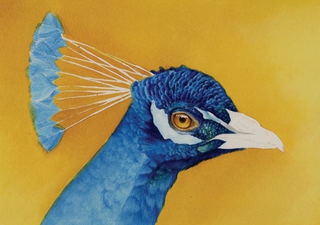
It’s mostly routine from now on. I made lots and lots of little strokes to create first layer of feathers. Then I continue darkening and defining them. I decided to enhanced the light on top of the feathers with white gouache, which wasn’t really smart, because the resulting contrast was too stark (which lead me to remove the gouache in later steps). The important thing when painting feathers is to watch their shape and direction (which is easily imitated witch the direction of brush strokes), and how closely they lay on each other. Where is a greater space between the feathers, there’s usually a darker area, where the feathers are closer to each other, there the shadows aren’t so distinctive (or there aren’t any shadows at all).
Step 8
The head is much more defined here. It’s a bit too contrastive and it gave me some hard time to correct what I caused with my not very smart decisions 🙂 I think when it comes to watercolour, it’s always better to paint without a gouache, because it brings a foreign element to a painting (of course, there are times when you just can’t achieve the effect you want without it – but this wasn’t the case). Blue indigo, on the other hand, is a very dark colour, close to black – and sometimes just may be better to create a dark shade with more overlapping colours than one very dark one, which can look a bit… dead :o)))
Step 9
Still don’t quite looked as I imagined. I started to work on the rest of the head nevertheless. The dark tones are created either with paris and delft blue, or with a Prussian green and dioxazine violet (that would be the shadow under the beak).
Step 10
I finally got annoyed by the gouache and just washed it all away (I dipped my small brush in water, dampened the white area and then carefully pressed a paper towel against it. Worked like a charm 🙂 ) I repeated the same process with the indigo, and make some re-defining with delft blue (because now of course the feathers looked a bit blurry). I added another layer of cerulean strokes to the whole body. I also made a complete wash (no strokes this time) over the neck with cerulean blue. Then I started defining the small feathers on his “crown” (how’s this thing even called? In Czech we would say “korunka”, which mean “a little crown” :D). Again withe cerulean, paris blue and finally delft blue (which is really a charming colour, stucked somewhere between blue and violet. I got enchanted by it pretty much every time I use it).
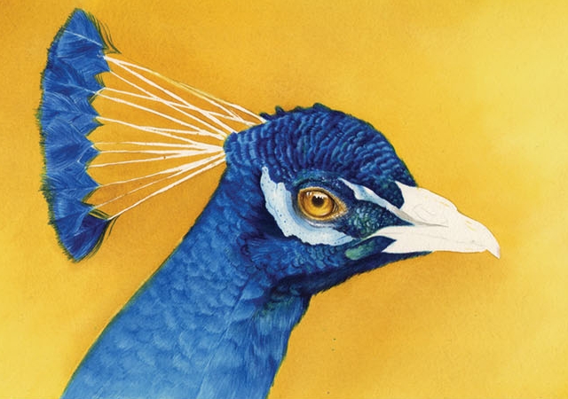
Step 11
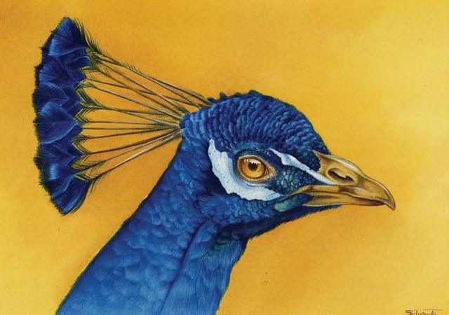
Well, it’s not really a step, as I’m all finished here 🙂 The crown is finished with some intense shade of delft blue (I diluted the colour as little as was possible), and I defined the quills with a raw umra and payne’s grey bluish. I also finished the neck, again with the same colours, really 🙂 The only remaining thing was the beak. I wasn’t sure which colours to use on it (in reality it’s something between light brown and grey, but it didn’t suit me here), so I just decided to go with colour scheme I used on the rest of the picture – which meant a light ochre, some indian yellow, raw sienna for the beak itself, and dioxazine violet and prussian green for shadows.
I hope this walkthrough was useful for you at least a bit 😉
You can check the final image in high-resolution here (750 x 541, 500Kb).
To get more texture of animal, we recommend visiting 3d.sk site.


Latest Comments