“Figure painting workshop” by Joel Carlo
Painting a figure from life or from a photo can be a daunting task. There is a slew of information to process such as evaluating the figure’s size, form, value, contrast, gesture, color… the list can be pretty long. And while each of these aspects takes time and patience to master, it is only when you begin to understand how to break down an image visually that re-creating what’s in front of you becomes less difficult.Figure drawing in itself is an exercise in re-creating what is already there. It’s a lot like putting a puzzle together… every piece must fit perfectly in order to re-create the final image. The pieces are a set size and shape and can not deviate or change because if they do, then so does your final image. So in essence, what we are trying to do is fit these pieces together one by one without changing them in order to complete the “puzzle”.In this tutorial, I will create a figure study in Adobe PS using a photo reference graciously provided by Marek of www.female-anatomy-for-artist.com. Along with explaining this visual exercise, I’ve provided a video at the end of this tutorial which you can watch to help you grasp the concept of “seeing shapes” and apply them to your own digital figure studies. Let’s get started.
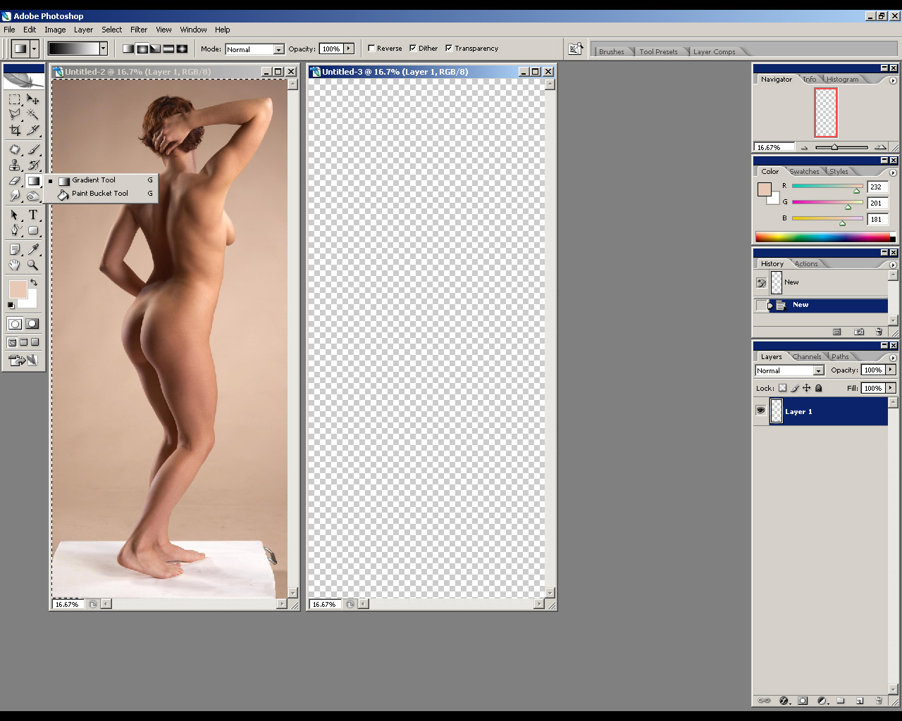

1. I begin in PS by cropping the reference photo and create a new document in the exact dimensions as the cropped image. I tend to work fairly large in order to allow myself some flexibility when adding detail later on, so I set my dpi setting to 300. If you’re running on a slower system a setting of 200 dpi or even 100 dpi will suffice.
2. Once my new document is created, I go back to the cropped reference photo and apply the cut out filter found under FILTER > ARTISTIC > CUT OUT. The cut out filter is great in the sense that it allows you to break down an image into simple shapes and allows you to create a simplified color palette to use in this exercise.
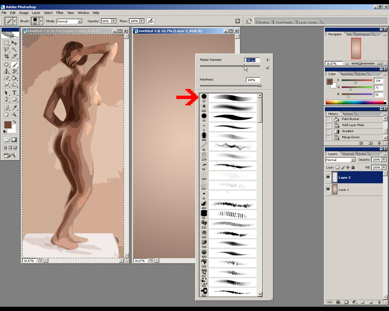
3. With my filtered image in place, I create a gradient background in my new document with the Gradient Tool using colors pulled from the reference image. I then create a second layer which I will use to paint over the background layer. Once this is done, I choose a standard round brush with a smooth opacity fade and adjust its opacity setting to about 50%.
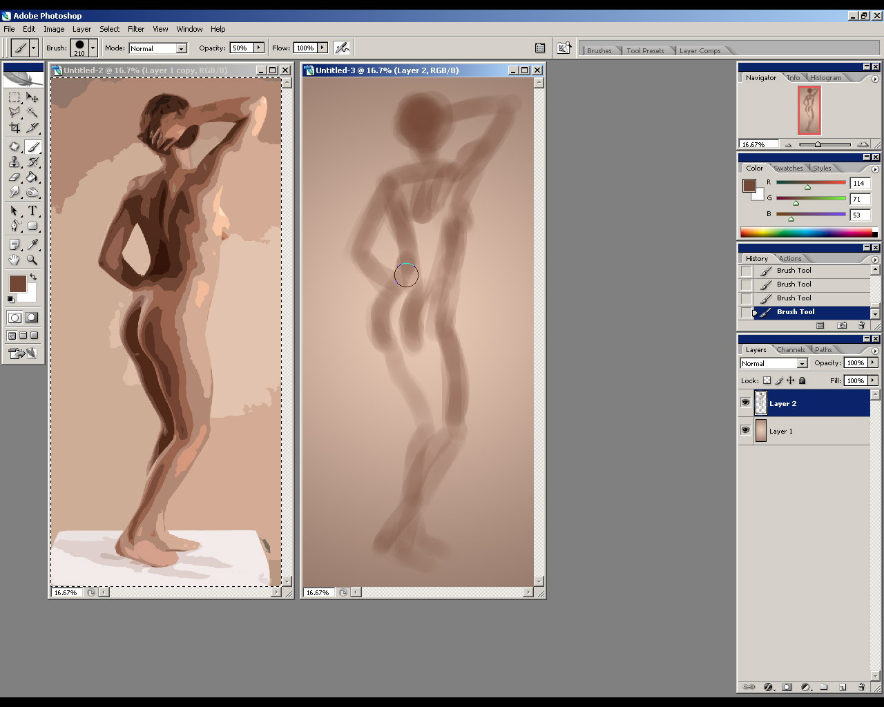
4. Starting on the empty layer, I begin to rough out a basic silhouette of the figure. I do this using very light strokes while keeping the document close to the reference image. Working in this manner allows me to better gage the accuracy of my work while making it easier to compare the overall size and proportions of the silhouette.
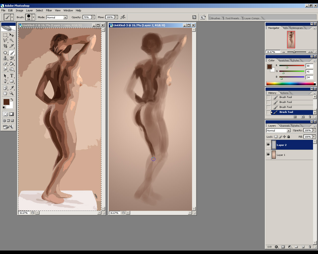
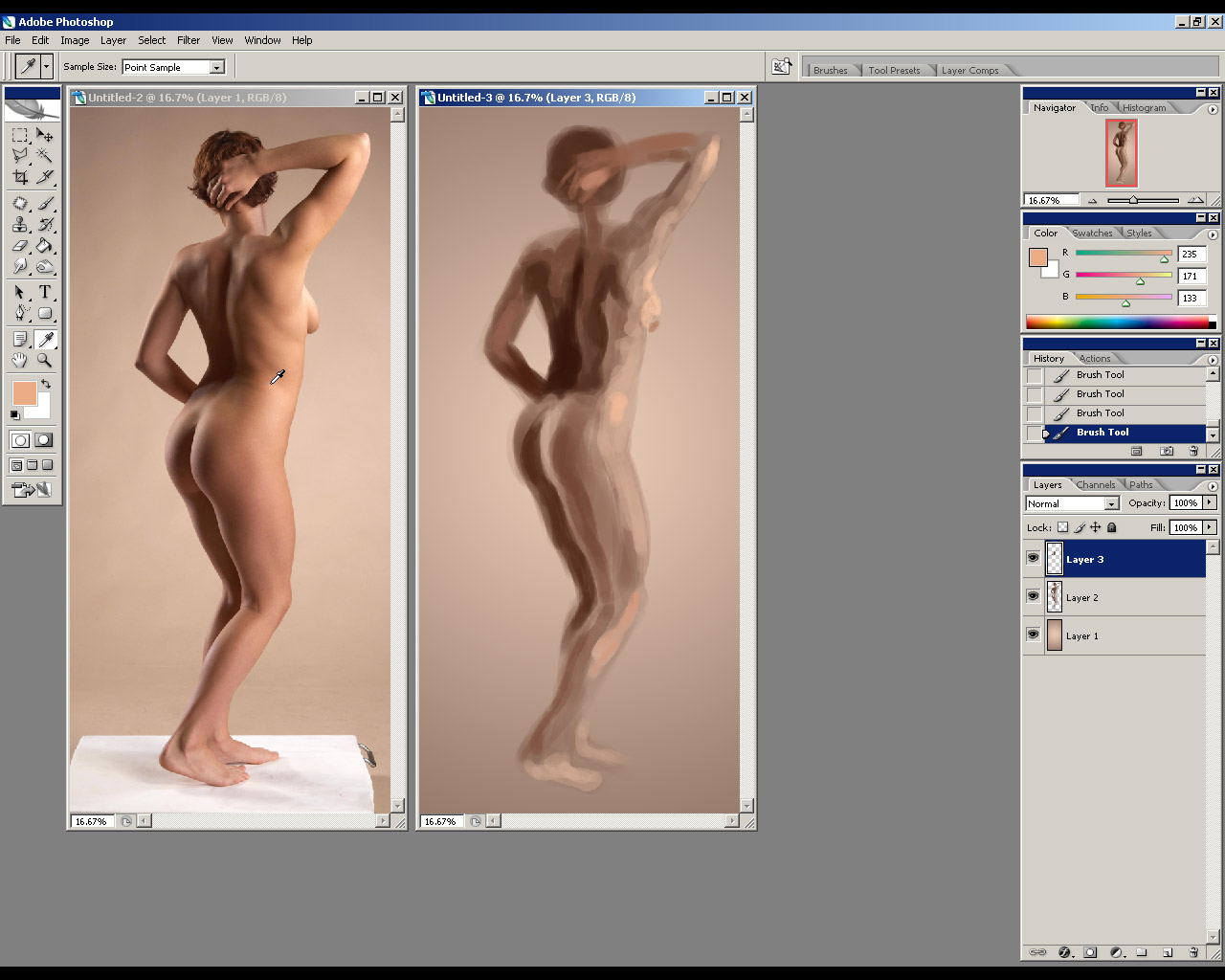
5. Once I’m satisfied with the silhouette, I begin to evaluate and distinguish the shapes within the tonal areas of the reference. Once I’m comfortable with their placement, I use the Eyedropper Tool to pick out color directly from the reference and proceed to draw these shapes over my silhouette.
6. As I work through the image, I will create new layers to draw additional shapes on. Using layers allows me to create each area incrementally and commit to new work only when I feel a shape has been established correctly.
Pages: 1 2


This is a helpful info.